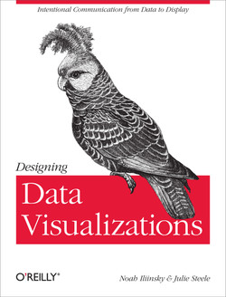
I got to review this book through O’Reilly, I made the mistake of reading it on the Kindle. Due to this I couldn’t make heavy use of all the links the authors shared and all the color images were black and white. Especially the latter was a handicap when reading a book about visualization, because it makes their arguments less powerful.
About the book: first off, its short! When you pick a book on the internet you generally don’t see how ‘thick’ it is, so in this case I was rather surprised that it was only 112 pages. So rather than being an exhaustive study about visualization a la Tufte, it was more of a general introduction. I guess you could say the authors sticked to their own mantra of trying to convey information efficiently.
The book focuses on two main topics:
What will you design?
This was the part I found most interesting, if only because they helped bring home the message that you should think about why you’re design something. Are you trying to explore the data or trying to explain the data? Furthermore it emphasized to keep in mind that your reader doesn’t (always) know what you know about the data.
How should you design it?
Here they introduce the reader to the basics of making good visualizations. Its like they mention in their preface:
It will give you the general lay of the land. It is a set of steps and rules to follow that will get you 80% of the way to turning out great work.
Simply sticking to these basic rules will go a long way of not screwing up your visualization and from there you can improve to make it better.
So would I recommend this book? If you haven’t read any books about Data Visualizations then this book is a great introductory tour. If you’ve already delved deeper into the subject, then the book might not hold much news for you.
