When all the toes are set and the final results are calculated the ‘fun’ part can begin! Now we get to analyze the results and draw smart conclusion based upon them. Note that some results are calculated based upon the average contacts (like the pressure per zone, the location of the zones and the foot axis) while the rest are calculated for each individual contact and then averaged.
The average pressure over time with a standard deviation (N/cm^2). This is basically the sum of all the sensors divided by the surface of all the activated sensors.
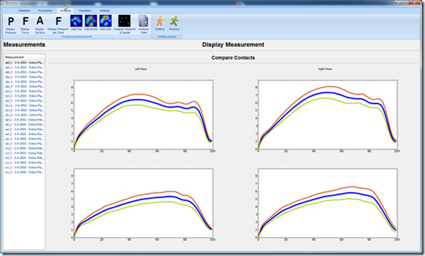
Note that the surface is probably an overestimation, because even when a sensor is partially loaded, it will still count the entire surface. There are some ways to counter this, but probably a better way would be to ignore the really low values (<0.1 N/sensor). Interestingly enough the values remain pretty constant once they reach their maximum.
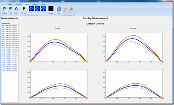
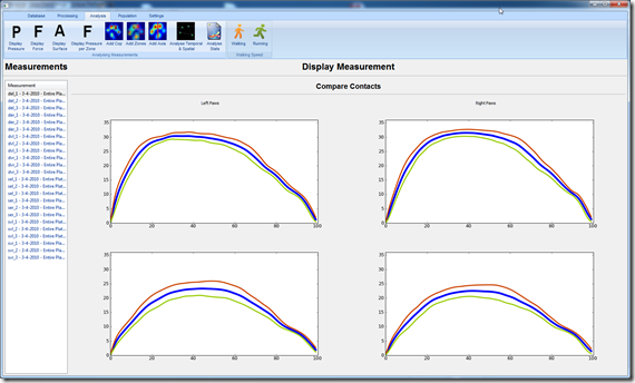
The average force over time (N), which is simply the sum of all the activated sensors.
In humans we generally see an M-shaped curve (purple line), which is due to the ‘rockers’ in the human foot. The first peak is caused by loading the the rear foot (white line), the second peak is caused by shifting the weight towards the forefoot (green line) in order to push off. In the dogs case its just one peak, this most likely has to do with the way quadrupeds walk.
The average surface over time (cm^2). The surface is almost the reversed of the pressure, the dogs tend to put down their paws very flatly (all toes making contact) and don’t take start taking them off until late (> 60%) in the stance phase. The lift off also seems to happen pretty evenly in most cases, where first the central toe, then the medial and lateral toes and lastly the two front toes are lifted off.
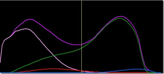
The average force (not pressure!) for each ‘toe’ or 2×2 zone (N/cm^2).
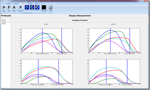
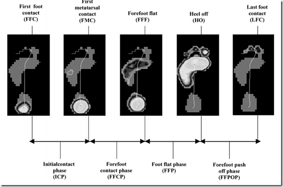
Blue is the central/rear toe, then from medial to lateral: green, red, light blue and purple. Because the surface is the same, you can easily compare the forces. The vertical lines depict when the central toe reaches its maximal pressure and when its lifted off. This is analogous to the phases of gait as described by Willems et al (2004], which describe very reliable phases during the roll off of a human foot. Starting at the landing of the heel to the first contact of a metatarsal to the contact of all metatarsals to the lifting of the heel and eventually the foot.
As you can see there are a lot of similarities between the left and right paws and also within the paw the force values within each toe are very similar.
The center of pressure plotted on an image of the maximal values of each sensor.
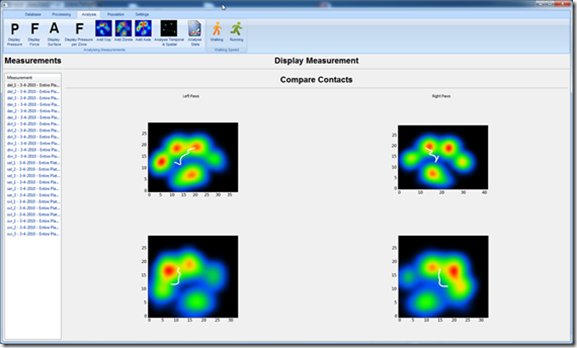
It seems every paw first lands more on the lateral side, only to stabilize somewhere in the middle. In most cases the line is so straight which indicates there’s a very good balance between the medial and lateral side of the paw. Imagine the ankle as a weight scale, where the left and right side are in a constant battle to keep the scale in balance. In order to keep them in balance it requires the muscles on both sides of the paw need to contract with the right amount of force. I expect lame dogs, that may be lacking this balance, will show a completely different center of pressure.
The location of the toes (manually set by me).

The size is fixed at the moment, though technically I could reduce it to 1×1 or scale it up for larger animals. Note that the location in the images may be slightly off, because the interpolation I use (scipy’s map_coordinates) slightly translates the paw, which frustrated me to no end. I haven’t found a solid solution for this sadly.
The paw axis, from the central toe to a point between the two central toes.

In humans I believe the angle is between 2 and 12 degrees, where a positive angle means the paw is exorotated. Now my definition isn’t perfect, especially because I found some large variations in the shape and loading pattern of the central toe. However, I think it will help find extreme outliers in either direction.
The step length, width, duration for each paw compared to the other paws with an image of the relative positions of each paw
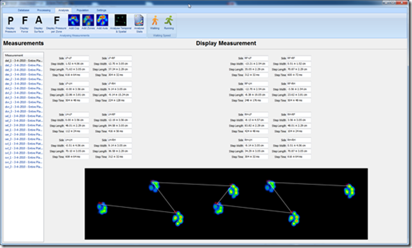
I’d love to figure out how to change the image with the relative positions to an animation that shows how the paws are positioned to each other over time as well. Especially for the running trials, it looks like the paws land very close to each other and you can’t really imagine what this means in practice. Still the current image does help visualize how large the steps and strides are, if the dog were lame on one paw it would probably have an asymmetrical step length and easily stand out.
And lastly a dashboard with some useful stats.
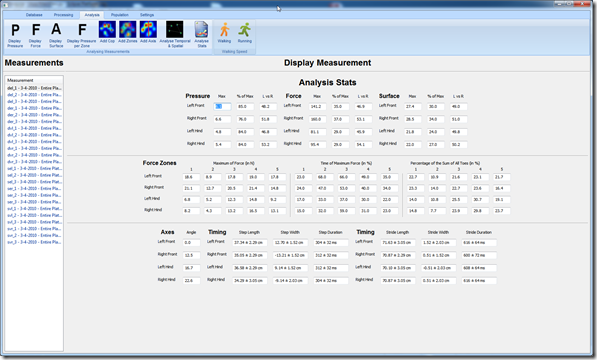
For Pressure/Force/Surface I calculated the maximal value, the percentage of the stance phase where the maximum was found and the ratio between left and right. I first used an Asymmetry Index (ASI), but I found the values much harder to interpret and probably only make sense if you can compare them between populations. For each of the forces per zone I calculated the same, with the exception that the percentages at the end aren’t left vs right, but the ratio between the toes (which seemed much more useful).
At the bottom you find the axis in degrees, where exorotation is positive. The ‘Timing’ next to it gives the step length, width and step duration just comparing the left vs right paws (step) or the paw with itself (stride).
I actually already made changes to the version you see above, because I initially had the id’s of the two protocols (running and walking) hardcoded in my calculations so I was sure everything would work. But it turned out to be fairly trivial to made it generic enough to allow any protocol id. The list of measurements on the side is therefore replaced with a list of protocols, so you can easily switch between them.
In my last post I’ll talk about the future changes I’d love to make, so read on!