It’s been nearly three months since my last blog post. I had asked a question asking about how to insert data into a MySQL database, because I needed to store my measurements. Today I’ll take you on a small journey and show what I’ve done since then.
Starting with the database
I started out with a wxPyton example that allowed me to fill in basic database info, like the subjects name + address.
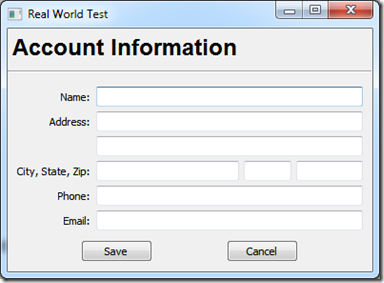
Then I tried inserting this into MySQL when you pressed the Save button, which required me to learn how to retrieve values from text controls and trigger functions when pressing buttons.
Adding a Ribbon
Next I added a Ribbon, because I just needed to have one. As you’ll see later on, my application has clearly separated parts, therefore it makes no sense for those parts to share buttons. The Ribbon takes care of that.
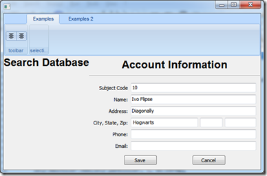
Moreover, I learned how to add other segments to a Panel (and why a Panel != a Frame) and I got to mess with Sizers to divide everything on a Panel.
Adding a search box
Now that I could add subjects to my database, I needed a way to search through them. So I added a Search control and a list to display them.
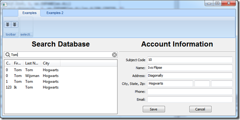
I learned a new thing! If you don’t add unique constraints, you’ll get a load of duplicates subjects in your database... I also looked into a tutorial that explained how I could ‘switch’ between panels. Basically you add all panels to the main frame, set one of Show and all the others to Hide. Then based on some input, you switch the other frames to Hide and the next one to Show. In my case, switching tabs on the Ribbon triggers this function. Neat!
Adding measurements to the database
Now my application was already getting more complex. I had several classes for all the different panels, added icons to each of the buttons and moved every button from the panel to the Ribbon. I also added a Session panel, where you create a session and add all the different measurements that belong to that same session.
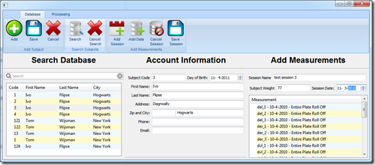
Small detail: I switched from using list controls to ObjectListViews, because it creates list controls from model objects. Kind of like an ORM I guess. It took some getting used to, but after figuring out how to do things like returning the selected object, I like it a lot.
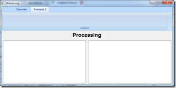
On to processing the measurements
Oh how I love rapid iterations! I made a first version of the Processing panel that should display a list of all the measurements and an image of the entire plate.
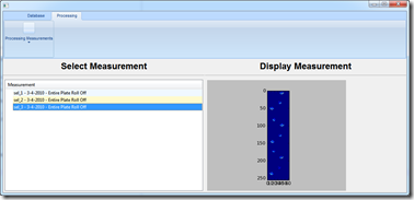
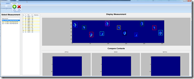
Fast forward, I got added a list with all the contacts that were found in the measurement, I rotated the image so its horizontal so I had space to display average contacts below it. I had some ‘scaling’ issues, because I still didn’t understand sizers 100%. But finally I got more or less what I intended: an average image of the 4 different contacts (LF, LH, RF, RH) and in the middle the currently selected contact.
I also encountered a peculiar behavior, where the Ribbon Panel won’t display any buttons until you actually the ribbonbuttonbar contains at least three buttons... Very strange! While this was easily ‘solved’ by adding a temporary dummy button, a much better solution was adding keyboard accelerators (see snippet).
wx.AcceleratorTable([(wx.ACCEL_CTRL, ord('S'), ID_SAVE), (wx.ACCEL_CTRL, ord('N'), ID_ADD), (wx.ACCEL_CTRL, ord('F'), ID_SEARCH)])
I’ve added keyboard shortcuts for nearly every important function, which also saves me a lot of time when I have to test a new piece of code.
We want to see results
While the processing panel was far from done, I wanted to visualize the results in some way to see whether I was actually doing a good job on the contact annotating front.
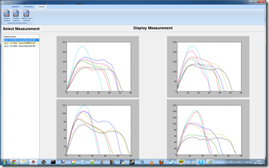
So I added panels to visualize the sum of the pressure over time, temporal and spatial information and an average contact for the four paws.
Work in progress
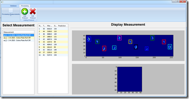
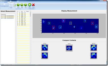
After that I went back to work on the processing panel. While there have been some intermediate changes, this is more or less its current state. The currently selected contact is highlighted with a yellow line, the other contacts are white when unassigned, green (LF), cyan (LH), red (RF), magenta (RH) when assigned to a paw.
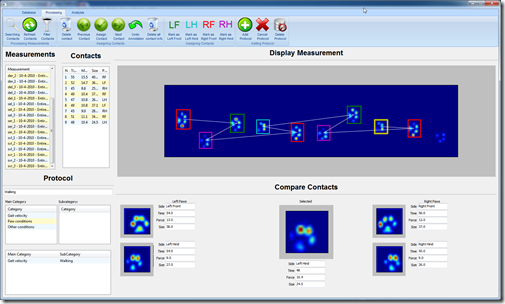
While in earlier versions you could assign contacts by clicking the average image below. However, the only way I could trigger an event from this was by using a child focus event. This had the unfortunate side-effect that it got triggered several times when focus switched and I couldn’t find a good solution for managing this. In the end I decided to add dedicated toolbar buttons and keyboard shortcuts, which work out fine. Just like in my Paw Annotator 1.0 you can assign contacts by pressing 7 (LF), 9 (RF), 1 (LH), 3 (RH) on the keypad, which maps nicely to the layout of the paws themselves.
Previous iterations only allowed you to annotate contacts, which means that if you made a mistake, you had to start all over! By now, you can undo them (Ctrl+Z) and cycle through the contacts with <—+–> and through the measurements with arrow up and down.
Deleting measurements was tricky at first as well, because a measurement has contacts and measurement data. The contacts have results tied to them. And based on one of the Stack Overflow answers, I started out using MyIsam instead of InnoDB. This means I don’t have any foreign keys to enforce the relation. So deleting meant some double checking before actually deleting things, because else I might end up with rough data in my database!
I also added numbers next to the average contacts, these help give you an idea which paw it might be based on the size, the contact time and the maximal force. It also features a prediction, which suggests what paw it might be. However, this is currently based on a simple equation where the current contacts is subtracted from the average contacts, assuming the difference is that smallest between the contact it belongs to. Obviously this is open for improvement, based on the results I hope to find!
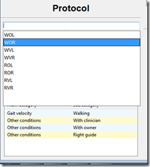
Another thing I added are protocols (and a medical history to the database screen). These are basically ways to label the measurements, so they can be categorized in the analysis. Examples of this are separating walking and running measurements or in humans barefooted vs shod measurements. The current implementation either let’s you pick several labels manually or use a ‘profile’, which is basically a collecting of regularly used labels. Because I’m lazy I added a Magic Eight Ball button, which parses my measurement names and assigns the correct profile. Sadly for my users, I haven’t figured out how to let them tweak this through a simple GUI.
Lot’s of database stuff
Don’t mind the icons, it’s already starting to become too clunky for my liking and perhaps I’ll find alternative ways to manage these functions. I’m also not 100% happy with the current interface, because there’s so many lists and text controls that it get’s confusing to what to do first.
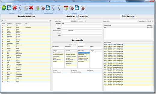
However, compared to the previous version, you have a list of sessions that are attached to a subject. Each session consist of measurements and like the protocols, there’s now an option to add a medical history (anamnesis). This will also be used to categorize the results in a more comprehensible way, though if it get’s more complex, I think it will need a wizard to be really useful in a clinical setting.
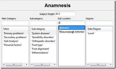
I actually ‘wasted’ quite some time to make this as user friendly as possible, by implementing an autocomplete that displays any match with the options from the list. Each list is connected to the one on its left hand side, so Primary problems has six subcategories, System diseases may have yet another amount of subcategories and eventually you get to say how severe it is or where something is located. Please note: this is work in progress!
Again, while making this I ran into some headache inducing problems, because while the list is very complete for orthopedic shoemakers/podiatrists, that doesn’t really make it useful for veterinarians. So again I need to come up with a way to allow the user to alter these lists, back them up and restore them when they update the software... Sigh
We want more results
While its nice that the application now allows users to add data to subjects and annotate all the contacts, in the end they want to be able to analyze them. So I spent some more time getting the results in better shape. Since currently the results aren’t separated based on their protocol (yet!), these results are an average over all the trials, which well... can give some strange results.
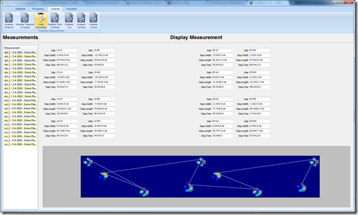
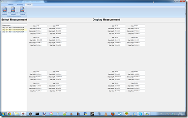
Here’s an example of the temporal-spatial screen, where you get the step length, width and time for each paw relative to itself and the other 3 paws. Below I’ve tried to recreate an entire plate image, based on the step length and width, so you get an idea of the walking pattern.
I tried a different way of calculation the foot/paw axis, based on Friso Hagman’s calculations, since my own experiments didn’t bare any fruit, I turned to Stack Overflow once more: How to calculate the axis of orientation? While Joe did a great job of implementing the calculation, the shape of the paws turn out to be pretty problematic. As Joe puts it: “In other words, a dog’s paw is close to round, and they appear put most of their weight on their toes, so the “back” toe is weighted less heavily than the font in this calculation. Because of that, the axis that we get isn’t going to consistently have a relationship to the position of the “back” toe vs. the front toes.” To spare myself the humilation, I’m leaving my current version out :-P
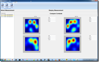
While my center of pressure calculations are most likely correct, or at least were before I implemented them in my application, but as the following image shows:
 >
>
apparently I’m displaying certain data upside down. So I’m wondering whether my horizontal axis is really correct and if the center of pressure and average contact even have the same orientation... I’ll probably have to try it on a human measurement, so I have a better idea of what it should look like.
Because the foot axis isn’t working as intended, I haven’t worked on my toe detection yet. I was originally hoping to use the foot axis to rotate the contacts to a neutral position, that way I can make a much better estimation of where the toes should be: two front toes on either side and on around the axis on the rear. Ironically, a better toe detection would allow me to do a better foot axis calculation, so I feel like a dog that’s chasing its own tail.
Power to the population
One the things I had in mind with the results was that I wanted to compare it with ‘normal data’, so you get a better sense of whether the dogs individual results are (ab)normal. While we’ve started to get some feeling for this in humans, this simply hasn’t been done for dogs.
This creates several problems: I don’t have any curated ‘normal data’ yet. Off course that’s the purpose of this project, but that means I’m aiming at a moving target. Another problem comes from differences within the population, there are differences in weight, in walking patterns, the lack of distinguishable toes and several unknown factors that may cause large deviations within my clusters. This causes several issues: Should I normalize the pressures so I can compare small and large dogs or are there other factors that make this comparison useless? Does the difference in walking patterns have a significant impact on the pressure distribution or is the effect neglible? How should I compare contacts with and without distinguishable contacts, should I guesstimate their location for a comparison or not?
While its not a problem to go down each path, calculation these different solutions for highly dimensional data (5 weight groups, 2 walking speed, 4 paws) is quite cumbersome, different for most of my results (1 value, 8 values, 1D arrays, 2D arrays etc.) so you can see I can easily waste a week chasing the wrong idea. Another issue is that I need to display all these results in a sensible way and maintain a usable GUI to switch between the different modes. Its clear that there are still some challenges ahead!
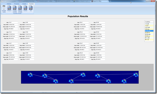
Given that I only added my population based results last week, there’s not much interesting to show you. But here’s an example of the temporal-spatial results, based on the weight categories and walking speeds.
Currently all the population results are being calculated every time I need them, since I haven’t decided on a definitive format yet. I do plan to store the average + deviations for every dog, for each atomic grouping. In this case I would end up with two results for each dog: its walking and its running results, that way I see what the most sensible weight categories are and try to figure out what walking patterns there are.
Conclusion
Please keep in mind that three months ago, I had never worked with MySQL or wxPython before. My only programming experience was basic data analysis, yet here we are with a first rough version of an application. It now consist of little over 100 Python-modules, which allow anyone with a MySQL server to run it fairly easily. I have a lot of challenges still ahead of me, but I’m certain that it will be interesting to see what my application will look like in another three months from now!