After several months of pain, sweat and tears I’ve finally wrapped up a first alpha version of my app! For this initial version I mainly focused on getting features working in a semi-usable way, which means it may look rough around the edges, but it gets the job done and in most cases relatively fast. As some of you may remember, we’ve measured over 30 dogs with each 24 measurements. Each measurement containing anything between 6 to 12 contacts, depending on the size of the dog. This leads to a total of about 7000 contacts(!) which I’ve manually assigned with labels for each paw (Left Front, Left Hind, Right Front and Right Hind). On top of that I manually assigned the location of each of the five toes, though I cheated by only calculating this for an average contact based on whether the dog was running or walking. Still this means 25 dogs, 2 types of trials, 4 contacts and 5 toes totally in around a 1000 toe positions. Note that the amount of dogs slightly reduced, because some of them were so small or light that it was impossible to discern any toes.
Now I bet you’re curious what this all looks like! Well I won’t keep you waiting any longer.
. While the current 48px are probably a bit overkill I’m still fairly happy with them. The only thing that bothers me is all the stock icons and the depressing amount of duplication. Worse, because I compressed so many functionality into one screen I’m also stuck with a huge amount of buttons.
Basically it reminds me of this:
 based on tags (work in progress)
- Creating a session and adding measurements to the session
I think I’m going to reorganize the panel so when you start you basically get a Google like interface: search for a subject and you can get started. If you need to analyze new data then you press a button to add a subject and the other relevant buttons appear (making the ribbon context sensitive like Office) and display the panel to insert the data. Finished inserting a subject? Great we switch to the panel to add measurements. Want to add a more detailed medical history, switch the panels to display just those panels and adjust the ribbon.
Another reason for wanting to change the main tab is that this was literally the first code I wrote, which means it’s horrible. Even though I tried to maintain some sense of a MVC structure, but due to my limited experience I failed pretty badly and a lot of functions need to be untangled.
Processing the measurements
Now on to the more interesting stuff: processing the data.

- Save the zone locations in the database
- Undo all the zones in case you made a mistake (before assigning)
- Delete the zone
As you can see there’s a somewhat recurring pattern: create -> store -> delete
Perhaps I could ‘streamline’ this process by making the program assume what the user wants to do after certain actions, but honestly I think that’s far too error prone and we’re talking about science here. Shuttles have exploded for errors like this and we don’t want to fit a pair of orthotics based on erroneous data.
Besides, what computer geek honestly uses buttons anyway? I already added several keyboard accelerators to make very easy to be more productive. Ctrl+F to search, CTRL+O to remove incomplete contacts, 7 (Left Front), 9 (Right Front), 1 (Left Hind), 3 (Right Hind) which map to the anatomical order of the paws :
:
data = sp.ndimage.uniform_filter(data, smooth_radius)
thresh = data > threshold
filled = sp.ndimage.morphology.binary_fill_holes(thresh)
coded_paws, num_paws = sp.ndimage.label(filled)
data_slices = sp.ndimage.find_objects(coded_paws)
return object_slices
Now it’s not flawless, as you can see with the contact in the middle, it’s larger than the smooth radius used by the uniform filter. The result is that it recognizes them as separate contacts. The problem gets worse with human feet when any midfoot contact is lacking, because then it will split up the foot into a rear foot and a forefoot.
 this is a slippery slope. When the dog is running fast, the front and rear paws land on nearly the same spot almost at the same time. If the smoothing radius is too large, it might ‘merge’ these two prints. As with most algorithms, when you try to optimize for certain cases it’s bound to perform worse in other cases. The ‘easy’ way out is to make it as easy as possible to manually correct the algorithm and using the adjustments as feedback for future corrections.
, maximal force (in Newtons) and the maximal size of the surface (in cm). Originally I thought this list might be useful so you can see the differences between contacts, but I found I never looked at the list.
Instead, I’d use the comparing tool at the bottom. What it does is compare the currently selected contact (yellow square) with average representations of the already annotated contacts. It also predicts what contact it probably is based on a simple subtraction: subtract the selected contact pixel by pixel from the other contacts, the one with the smallest difference is likely to match it most likely. I’m sure there’s a better comparison, like using PCA, compare all the frames, not just the maximal values or comparing multiple values, but honestly I found that after annotating 2/3 contacts the comparison would do a pretty good job and otherwise even I had a hard to ‘guesstimate’ which contact is resembled most.
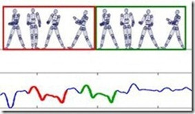
Something that might be of use, like someone suggested on Stack Overflow, is using Inverse Kinematics because if two paws are in contact with the ground, the next contact can’t be one of those two. This should greatly reduce the amount of options at any given point in time. Furthermore, in a lot of cases there’s a clear pattern in which the paws are placed, i.e. Right Front, Left Hind, Left Front, Right Hind etc. One might even wonder if the measurements where this pattern doesn’t occur was even a valid one. Obviously, this doesn’t hold in all cases, because some dogs inherently walk seemingly random, alternating between a normal and an amble pattern.
Peak detection in a 2D array
After processing all the measurements, the results get calculated. One of the results is calculating an average contact for each paw with the same protocol. This has several advantages, because loading all 3D arrays for each contact with the same protocol is quite data intensive. Furthermore, I’m mostly interested in average results not in single contacts, so I might as well compute the average up front. Now I understand this is an enormous data reduction, but as you’ll see next it comes with a similarly enormous advantage: I only have to set the toe’s positions (zones) once per paw!
You can image that with 4 paws and 5 zones and 2 protocols, it would become very laborious if I’d have to set the zones for every contact with the same protocol. Now I only need to set 40 zones, whereas else it would have probably been at least 200 per dog(!).

Because the story was getting so long, I’ve cut it in two pieces. So read on for part two where I talk about the results!